|
11/25/2018 0 Comments New eBook Design Tool! This brand new ebook design tool is a total game changer! Have you ever tried to create an eBook, free report, whitepaper and thought, “there MUST be an easier way to do all this?” Me too, and I spent YEARS searching for it, without any joy. Today, that all changes. Here’s a brand-new tool that allows you to crank out eBooks (or any type of PDF) for business or pleasure, in just seconds from now. Yep, we’re talking everything: — Instant content — Instant design — Instant formatting — Tons of flexibility and customization All for the price of a few nasty coffees. Check it out, before the price goes up! Grab Sqribble, this year’s hottest eBook design tool. Create your own ebooks in minutes and save weeks of frustration. Great for customer downloads to grow your email list, courses and more. Learn more about Sqribble here.
0 Comments
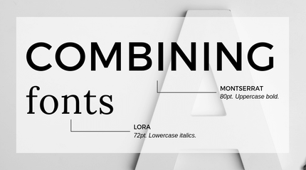
11/6/2018 0 Comments 3 Top Tips For Font Pairing Great font pairings are essential to great design. But picking great fonts can seem like a dark art. Choosing one font is simple enough, yet finding another font to complement it can be a journey to Helvetica and back. But it doesn’t need to be a nightmare. Here are 3 top tips for font pairing. 1. Stick to two fonts In the world of design, simplicity is best, and this is especially true when dealing with fonts. Too many fonts can look messy, so keep it simple by just using two. Give each font a specific role in your design – for instance, one font for headings, and another for the body copy. 2. What does your font say? Keep it legible. If you want to get your message across, ensure your typeface is a suitable size and is fit for purpose – playful fonts might be suitable for a heading, but not for body text. And keep in mind that every font has its own personality – playful, formal, modern, traditional… so ensure you use fonts that will support the message of your text. 3. Opposites attract If there’s one foolproof font pairing that we’ll always stand by, it’s this: a sans serif font with a serif font. You can use opposites when playing around with script and feature fonts too, by pairing them with a more restrained font. ***Awesome, you read the entire post! Hope you liked it. Why not share this Informative and valuable content? Much appreciated. Thank you. **** |
CategoriesAll Business Topics Did You Know That? Google & SEO Inspiration & Motivation Quotes Quote Of The Day Social Media What Do You Think Francine A. AuthorWelcome to my Blog. Disclaimer: I am not an expert on the subjects posted on this blog and is merely sharing from either personal experience, articles or other networking sources. Content is intended only as useful tips and resources for business owners and all who visit this blog. Subjects will vary from time to time. NOTE: Some posts may contain affiliate links to products I really love and recommend, which means I may receive a small commission, at no extra cost to you. I will use the earnings to maintain this blog and business. Archives
March 2023
|
© PRESTO VIRTUAL ASSISTANCE SERVICES
Privacy Policy


 RSS Feed
